
2019 Judge - Aotearoa Student Press Awards - Best Design and Best Cover

Selected Presentations:
Stolen Copies: An exploration of New Zealand graphic design appropriation and censorship.
Paper presented: Stolen Copies: An exploration of New Zealand graphic design appropriation and censorship, ArtCrime2018, City Gallery, Wellington, New Zealand. 22 October. 2018.

Image credit: https://artcrime.nz/artcrime2018/
Abstract: The role of design as a means to agitate and as a creative and visual spectacle allows the blurring of boundaries and viewer interplay when graphic content is coopted. Bruno Munari’s seminal publication Design as Art (1966)[1] will be used to consider the nature and intent of graphic appropriation and adaptation of visual culture which challenges copyright and intellectual property. The primary focus will be an exploration of graphic confusion via the appropriation and "re-design" [2] of graphic forms via alternative nodes of agency, reviewing how it operates and acts as a means of conscious raising.
Specific attention will be given to the appropriation of corporate logos parodies known as subvertising such as Spark (Kraps) (figure 1) and Fonterra (Fonterror) - (a visual form created to protest the dairy industry in New Zealand). Such instances allow an opportunity to evaluate how visual markers can become slippery signifiers which simultaneously distort and support opposing cultural paradigms. The act of creative copying, promotion and vandalism will be discussed alongside graphic design examples from New Zealand which question the role of provenance in the production and distribution of conflicting images and messages
[1] Munari, B., & Creagh, P. (2008). Design as art. London: Penguin Books.
[2] Wood, L. (2002) “Trespassers Will be Prosecuted: A B-Grade Horror in Four Parts” In Valentine, J (Ed). Printing Types: New Zealand Type Design Since 1870 (pp. 50-54). Christchurch: ObjectSpace.

Font Error – A discussion of graphic design and resistance
Paper presented: Font Error – A discussion of graphic design and resistance, Sociological Association of Aotearoa New Zealand, University of Otago, Dunedin, New Zealand. Dec. 2017.
Abstract: Subvertising is a graphic strategy used to create unauthorised adaptations of corporate advertising to comment on social, political and economic conditions. Activist Saul Alinsky proposes that part of the function of such forms of resistance allows “utilizing one part of the power structure against another part…”.[1] The graphic design of subvertising and culture jamming at large as forms of activism will be critically explored – particularly the graphic adaptation and experimentation relative to the practise of communication design that is outside of commercial control. Notable examples such as Fonterror, Kraps and McShit will be used to consider the nature and intent of the borrowing and adaptation of visual culture which challenges copyright and conflates alternative nodes of agency as acts of conscious raising and graphic confusion.
[1] Alinsky, Saul David.Rules for radicals: a practical primer for realistic radicals. New York, Vintage Books, 1972.


Slide taken from DCC1 Glocalisation Lecture
Design Culture and Context 1 (DCC1) - SEMESTER TWO - LECTURE: Glocalisation
Acknowledgement to Molly and Katie - DCC1 Communication design students in 2016 for post-lecture art direction and portrait framing. Thank you for noticing how standing in front of my projected lecture is beautiful.

Diss-Play – The transitory nature of fashion, corporeal bodies and mark making as mobile meme.
Paper presented: The End of Fashion, International Conference and Exhibition, College of Creative Arts, Massey University, Wellington, New Zealand, 8 - 9 Dec. 2016.
Abstract: Causing offense, annoyance, protesting or creating propaganda can be an integral role in the contemporary function of fashion. The colloquial term to diss refers to the practice of disrespecting or being in contempt of someone or something. This paper investigated instances where fashion mediates discursive behaviour and acts as a form of social commentary mimicking new media platforms. In particular, how fashion aids the promotion of ideas and how these ideas are sold, co-opted or commodified through graphic expression presented on bodies like walking billboards. And how this form of fashion captures and promotes spontaneous acts of citizen reporting commonly known as citizen journalism. Specifically exploring how ideas or messages are worn and distributed on bodies and their manifestation as an analogue form of mobile meme.

Thinking Through Fashion : Panel (L-R) Dita Svelte, Leigh Paterson, Laura Gardiner.
DESIGNER PUSSY: The role of design as an arbiter of gender representation within consumer culture.
Paper presented: trans/forming feminisms: media, technology, identity, An international conference at the University of Otago, Dunedin, New Zealand, 23rd – 25th November, 2015.
How are gendered bodies used to tell stories and create gendered culture relative to the practice of graphic design. How does design perpetuate gender conscription and stimulate consumer culture? Specifically how is the idea of a gendered body manufactured as a type of prop under the guise of activism or advertising? And what are the social and political ramifications that underpin these actions?

trans/forming feminism - Twitter feed

trans/forming feminism - Twitter feed
MANVERTISING: A CRITICAL APPRAISAL OF COMMUNICATION DESIGN IN THE MASCULINISATION OF CONSUMABLES.
Paper presented: PopCAANZ 3rd Annual International Conference, The Langham Hotel, Melbourne, Australia, June 27, 28, 29, 2012
Paper presented: “At a Crossroads: Reconsidering Gender and Identities” Colloquium, Otago University, Dunedin, New Zealand, 4-5 April, 2013.
Commercial graphic design is cultivates ideals around masculinity, using dominant male archetypes to manipulate ideas of gender identity through sophisticated advertising campaigns. This practice is certainly not new but there has been a recent shift in the way male identity is portrayed and the type of products that are being gendered has in turn changed drastically.
This form of “Manvertising “ is especially prevalent in the branding and marketing of consumables with campaigns being created exclusively for male audiences. These campaigns are perpetuating ideals about “being a man” often with a hyper-male tone and associated masculine imagery that identifies the perceived needs and wants specific to men. Companies such as Fonterra, Frucor and Burgen are targeting males in an attempt to make conventional gender free products “manly” - yoghurt and icecream are now laden with testosterone featuring taglines like “Real Man Food, Man” and “Feed the Manchild”.
This paper explored examples of “Manvertising” within the field of communication design, then discusses the impact and implications of this commercial practice on the perpetuation of gender stereotypes.

Fonterra Packaging - Mammoth Supply Co. https://www.mammothsupply.co.nz/
DESIGN INSTITUTE OF NEW ZEALAND (DINZ) - STUDENT GRAPHIC DESIGN NOMINATIONs:
2017
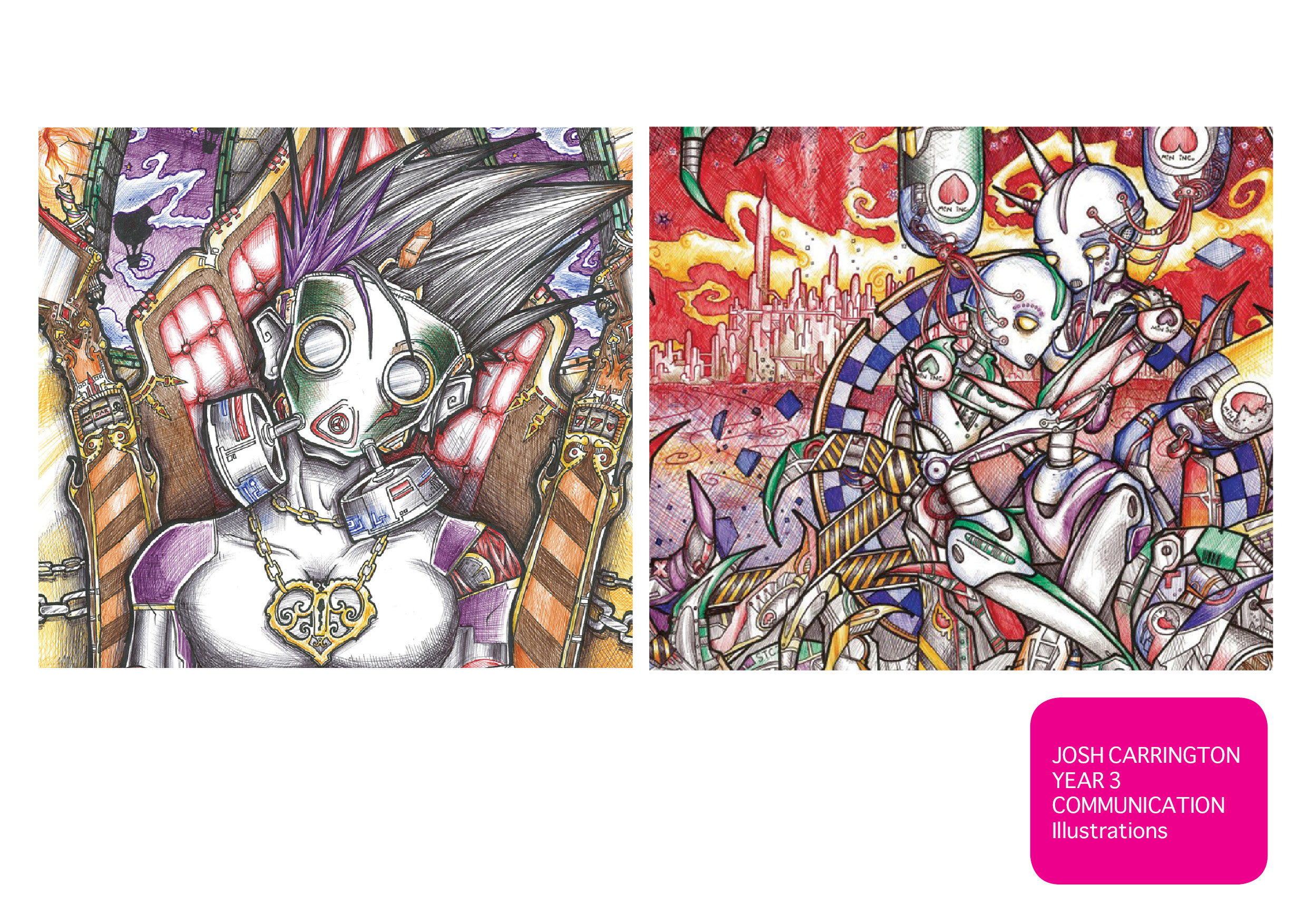
Finalist: Danni Cuthbertson - Dread
Supervisors: Leigh Paterson and Matthew Galloway
Photography: Alex Lovell-Smith


2018
Finalist: Year One Communication Design Students 2017 - Dust: Fine Particles of Matter
Supervisors: Leigh Paterson and Matthew Galloway
Photography: Alex Lovell-Smith
Held in the permanent collection of the National Library of New Zealand.


SPECIALISED TEACHING: Interdisciplinary Project - Pop Up Shop - 2010-2014
Paper presented: " BUY BYE - Flash retailing and education through collaborative experiences" Seventh International Conference on Design Principles and Practices, Theme: "Enthusiasm in and for design" as part of the Innovative Education panel, Chiba University, Chiba, Japan, 2012.
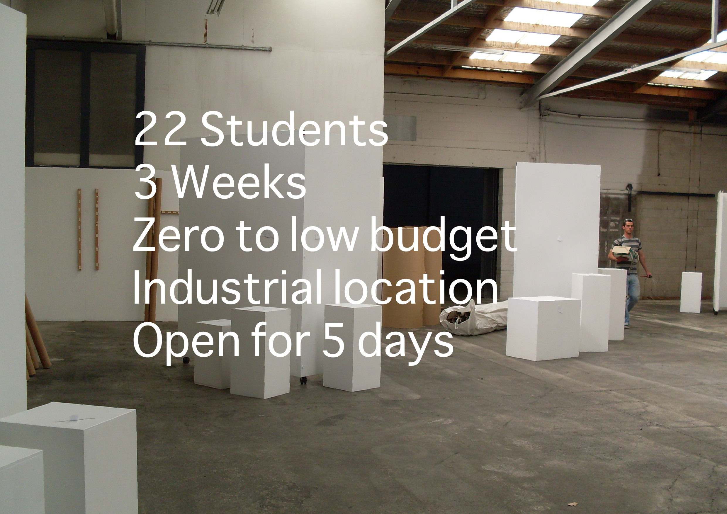
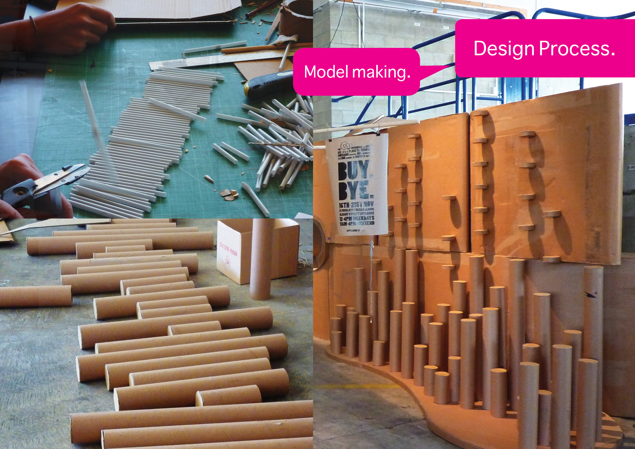
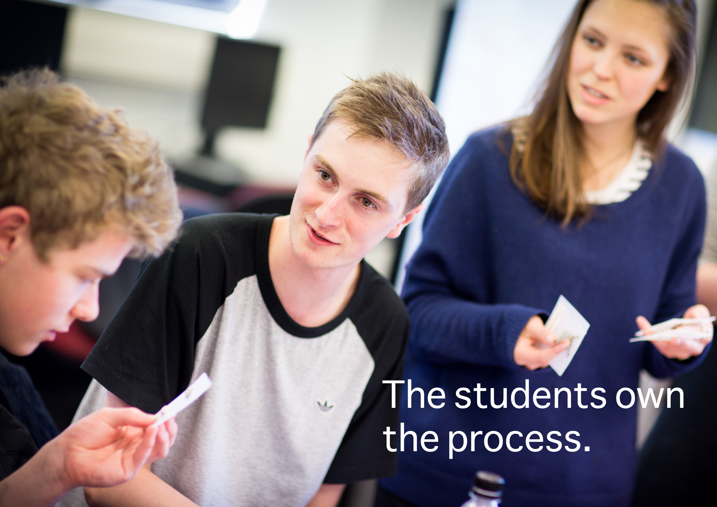
Part of my teaching experience has involved student supervision of an interdisciplinary project charged with the construction and promotion of a pop up shop. Each shop has promoted, displayed and sold the work of design students at the final end of year exhibition.
All pop up shops were created by year one and two student teams in an intensive three week course, with limited budget and resources and most importantly using collaborative teaching methods.

Lisa Richardson - “Pop-up Shop whakapapa”
The project ethos was to use the design process to create a stimulating and bespoke space to promote the work of students during their course of study. Giving them confidence through sales and the ability to test consumer markets in relation to their product line.
Thank you to all the students involved. And special thanks to Lisa Richardson whom I co-taught with.

This provided an opportunity to give insights into the project and teaching philosophy some of the presentation slides below:


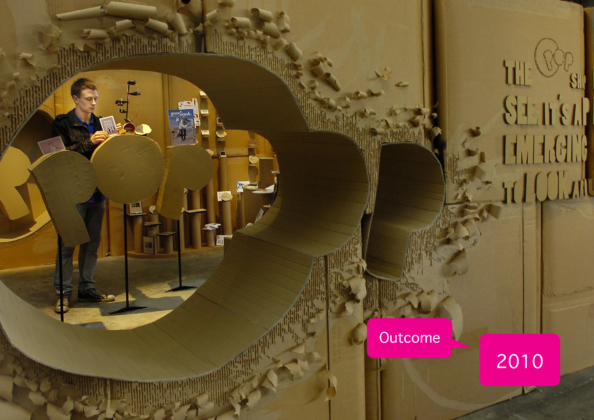

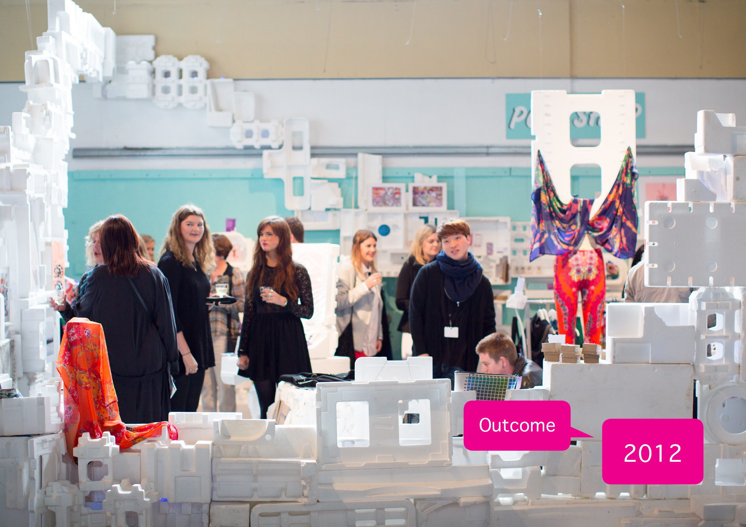

POP UP SHOPS 2010 -2014
2014 - UNSEEN


2013 - PUPS


2012 - $H*%


2011 - shOP


2010 - OPOP


