Image Credit: Ed Higbee
POLITICAL CAMPAIGN
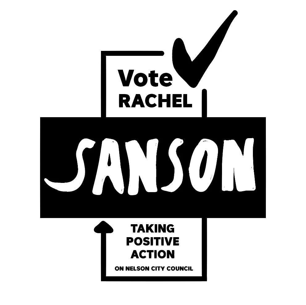
RACHEL SANSON: TAKING POSITIVE ACTION
Local body politics was shaken up with specific design consultancy and graphic implementation to evoke change to the local body council in Nelson, Aotearoa New Zealand.
Objectives included improving gender balance, reaching voting thresholds and a campaign that embodied a bipartisan approach.
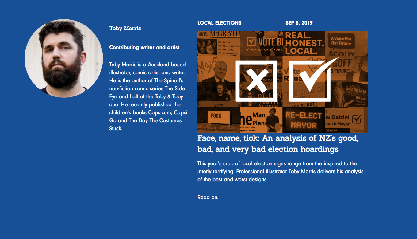
NATIONAL MEDIA PRESS
A national review of political design was instituted by The Spinoff’s Toby Morris who reviewed the nature and state of political musings during the election period. See the SANSON review below and full round up here.
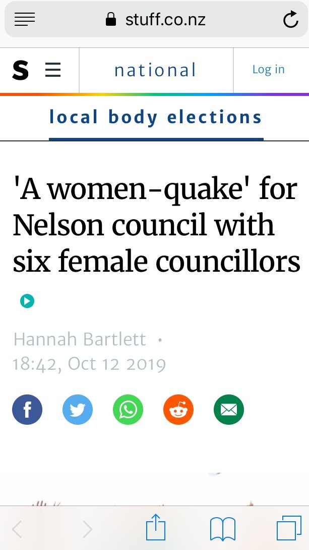
Rachel Sanson was the highest polling candidate in the Nelson election and received considerable press and commentary given the nature of the win and intent of the election objectives. With national media reporting there had been a “Woman-quake” in the area given the diversity of gender and age that was reflected in the overall voting statistics for the region.
“.. one of the best designed posters you’ll see.”

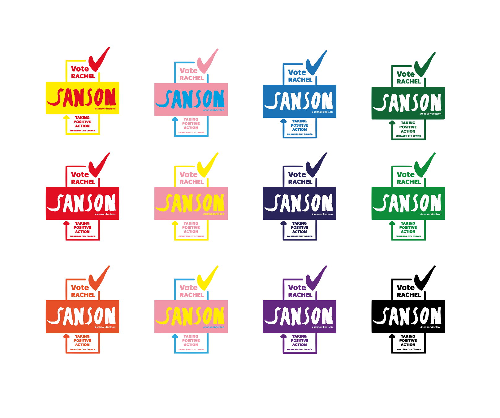
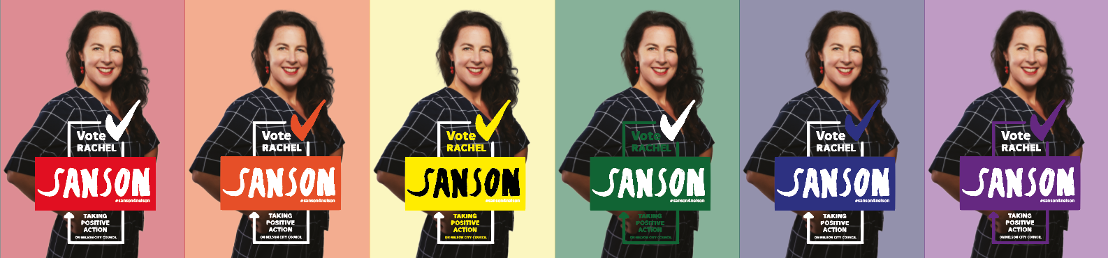
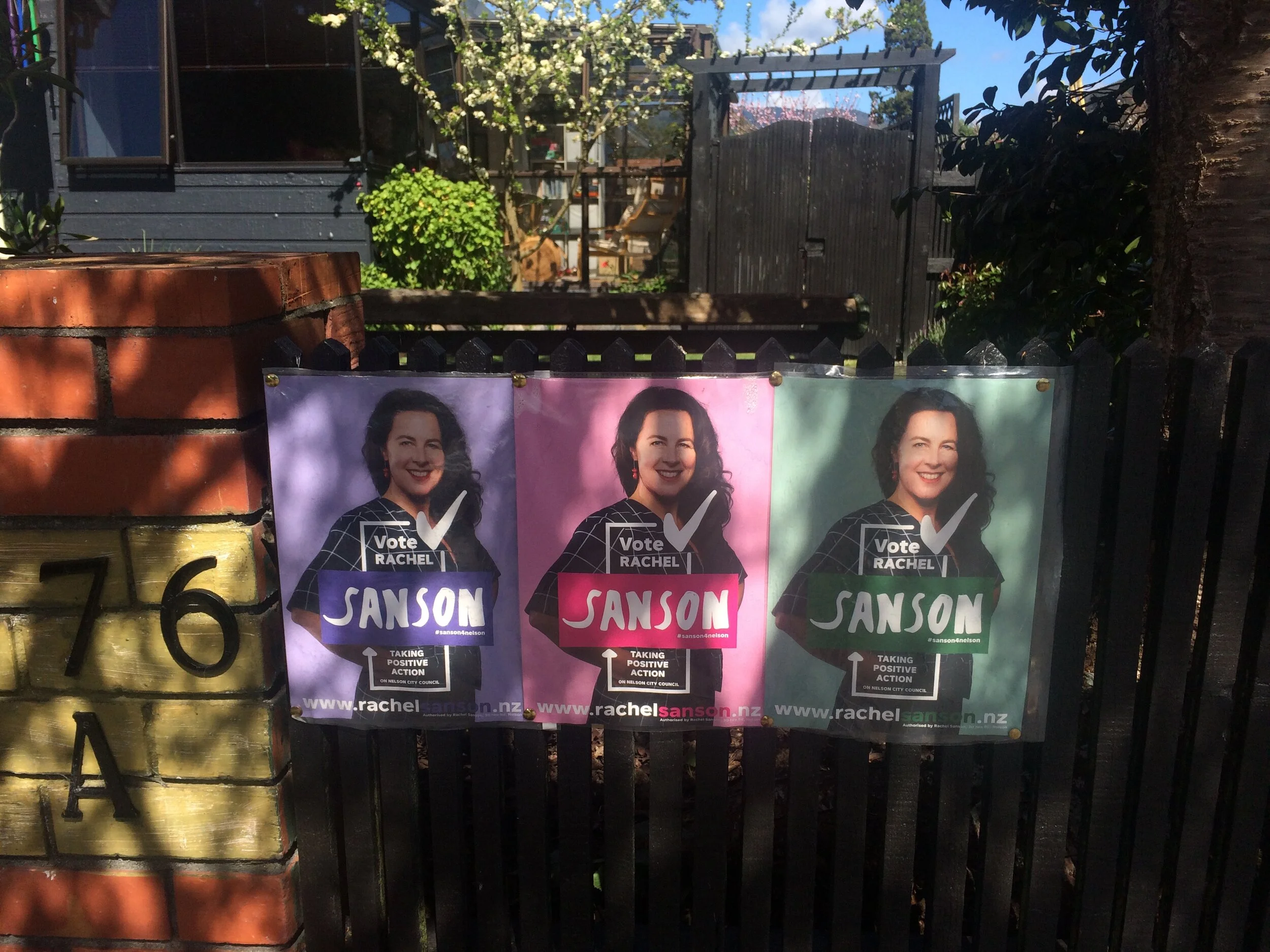
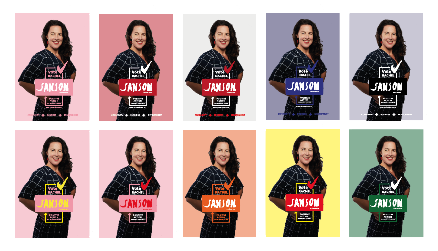
Pantone Sanson
The decision was made to mass customise Sanson’s campaign so that colour was no longer an indicator or static signifier. The batched colour blocking and display of content would promote Sanson in all colours to everyone. No limits.
Overtime this was referred to as ‘Pantone Sanson’ in the spirit of the pre-mixed spot colour system.
A colour for everyone and everyones colour.
TYPOGRAPHIC EXPLORATION
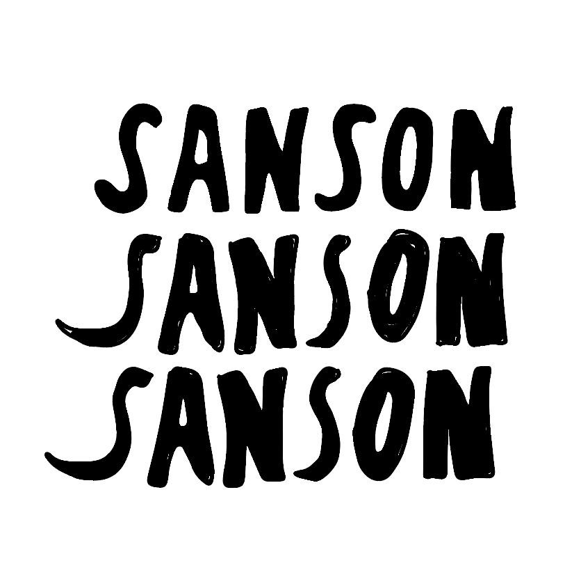
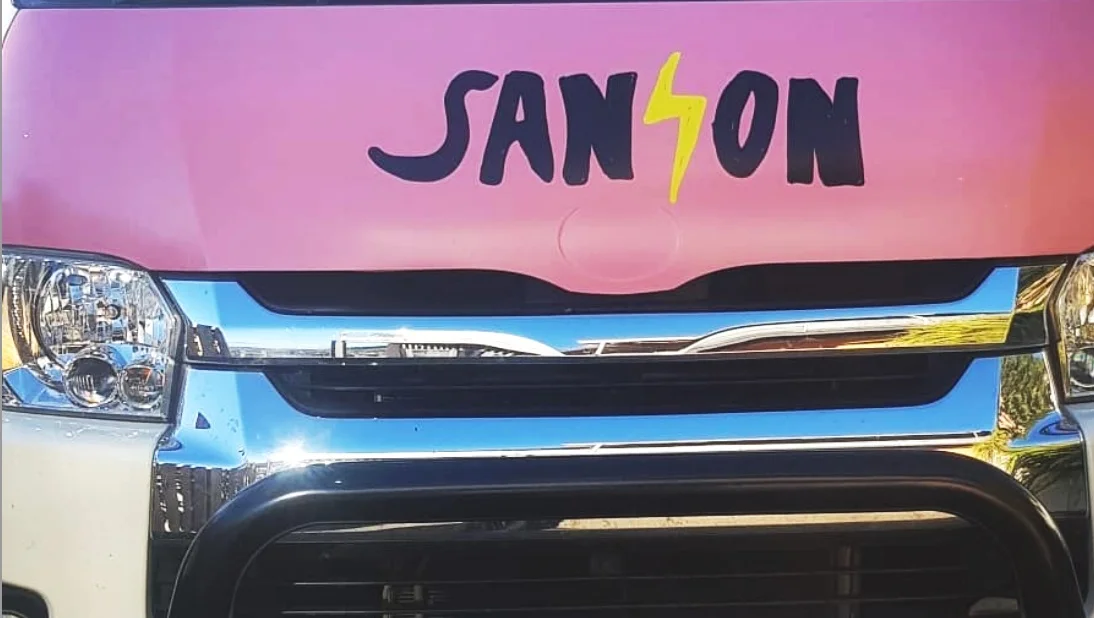
Hand rendered personalised typography was generated to strengthen Sanson’s campaign and public perception. Given the rich herstory of activism and enduring professionalism which forms a significant part of the candidates past, present and future kaupapa, SANSON FREE was created as a nod to the strength of the literal and figurative character translated through appropriate typography.
Digital Application
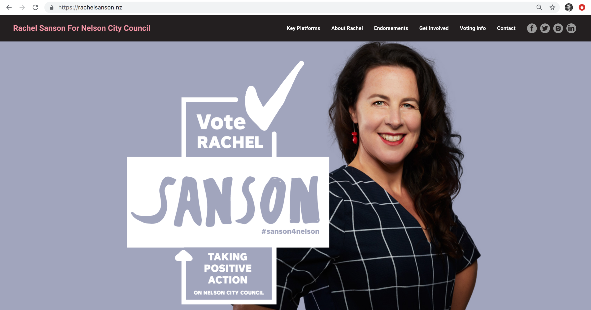

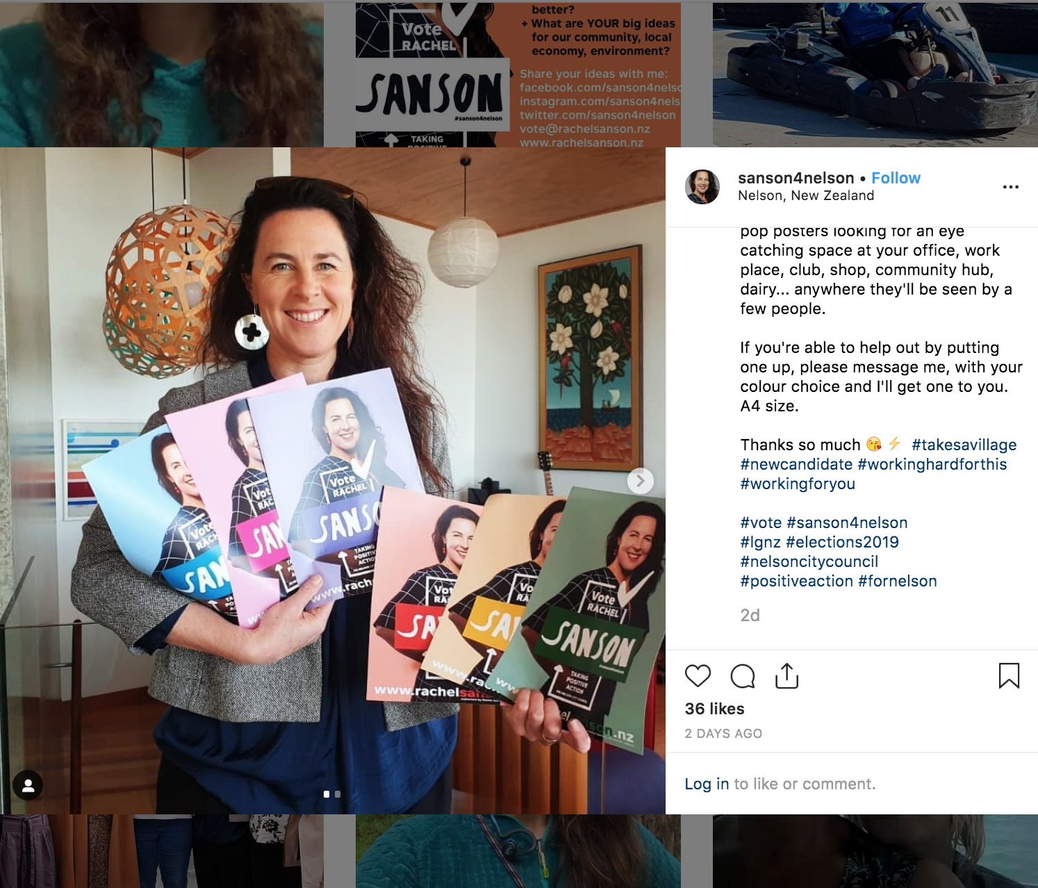
Image credit: Instagram @sanson4nelson

Graphic Application & ADAPTATION


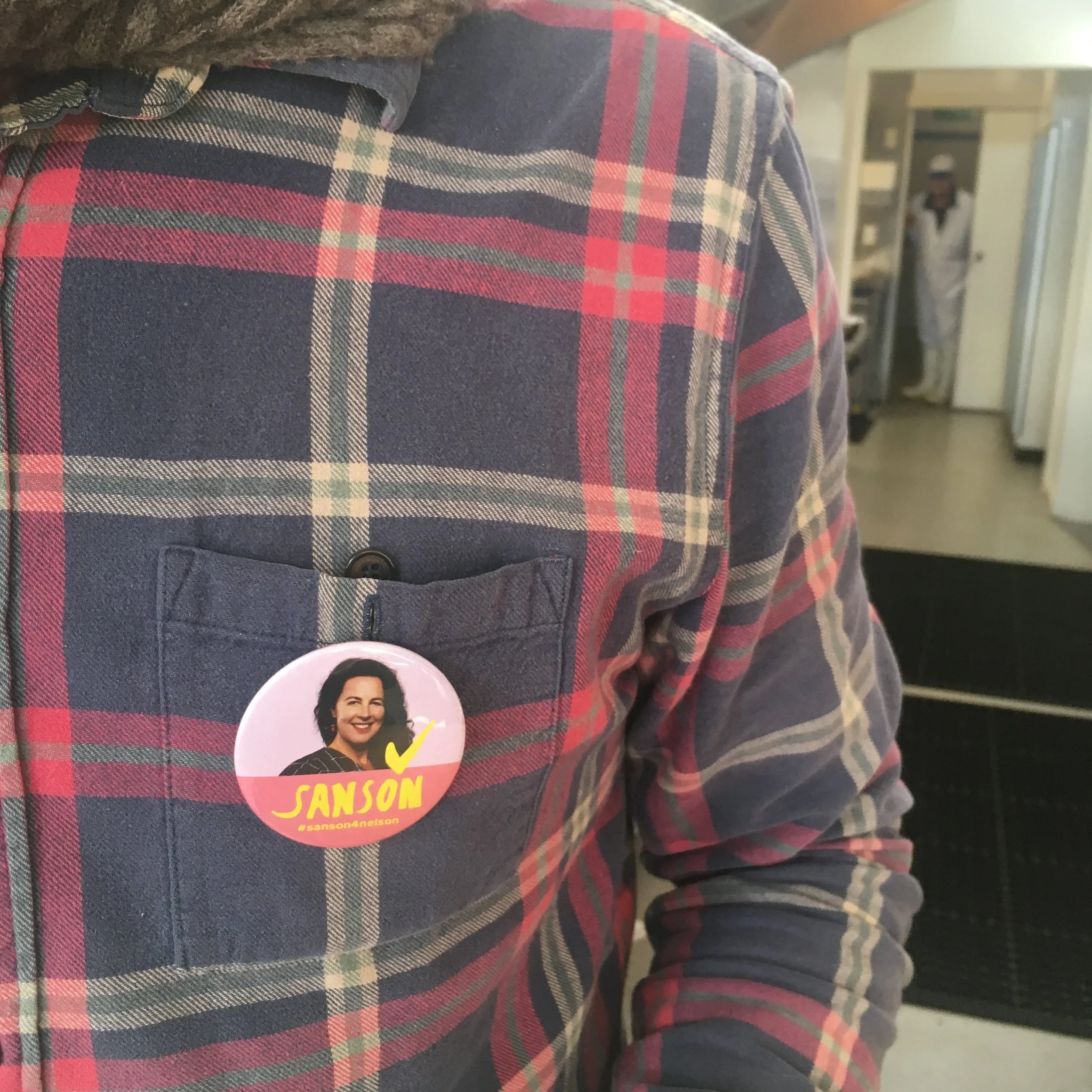


Image credit: Instagram @sanson4nelson